Making Small Spaces Feel Bigger
Discover lighting tricks, color choices, and furniture placement strategies that maximize every square meter.
Read ArticleChoose colors and materials that work with natural light and make spaces feel cohesive. We’ll walk through the decision process step-by-step.
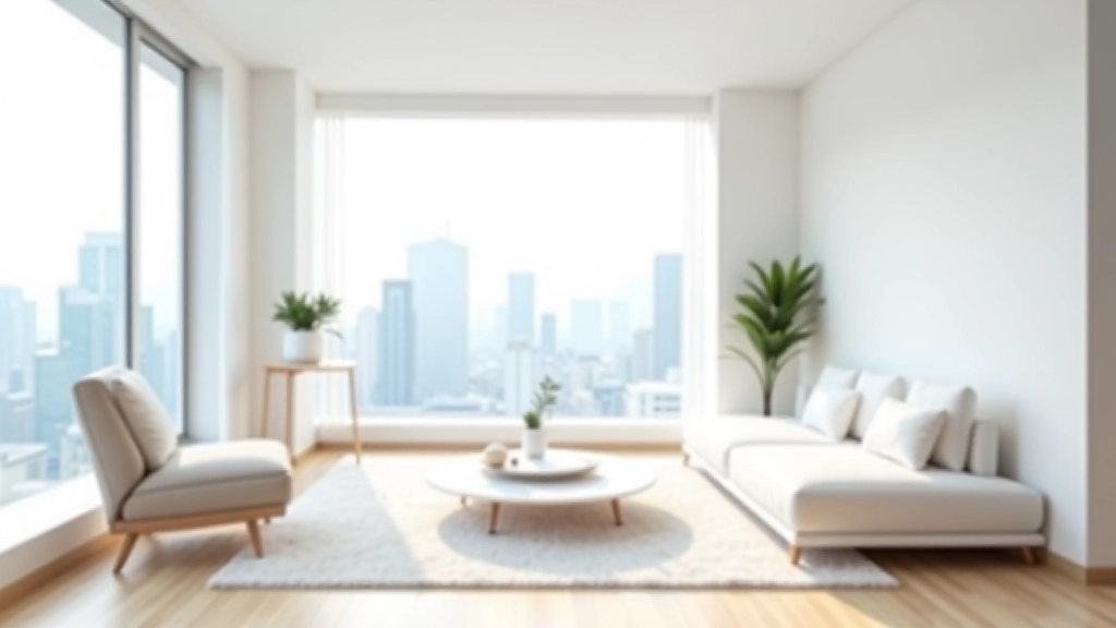
The right color palette and material choices can completely transform how a space feels. They’re not just about aesthetics — they affect mood, light reflection, durability, and how spaces function day to day. In Hong Kong apartments where space is at a premium, smart material and color decisions become even more crucial. They can make a room feel larger, brighter, or more intimate depending on what you’re trying to achieve.
We’re going to walk through the decision-making process so you can pick colors and materials with confidence. You’ll learn how to assess your space, consider natural light patterns, and create combinations that actually work together.
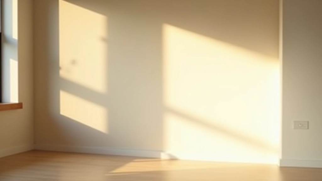
Before you pick a single color, spend a few days observing how light moves through your space. Does your apartment face east, west, north, or south? East-facing rooms get warm morning light. West-facing spaces flood with intense afternoon sun. North-facing rooms have consistent, cool light all day. South-facing areas are bright but can feel harsh in summer.
This matters because colors don’t stay the same under different lighting. A warm beige that looks inviting in morning light might feel dingy by evening. Greens shift dramatically depending on whether you’ve got natural sunlight or artificial lighting. Spend time at different hours — morning, midday, evening. Take photos. Notice what the space actually needs.
Once you understand your light, you can work with it instead of against it. In spaces with limited natural light, you’ll want lighter colors and reflective materials. Where there’s intense sun, you can go bolder with color because the light is already doing the heavy lifting.
A cohesive space doesn’t mean everything’s the same color. It means the colors you choose work together instead of competing. Think of it like a story — you’ve got a main character (your dominant color), supporting characters (secondary colors), and accents (pops of interest).
Most successful interiors use about 60% dominant color, 30% secondary color, and 10% accent color. That ratio actually works. If your walls are a soft grey (60%), your sofa might be a warm taupe (30%), and your accessories bring in deeper charcoal or brass accents (10%). The formula keeps things balanced without feeling boring.
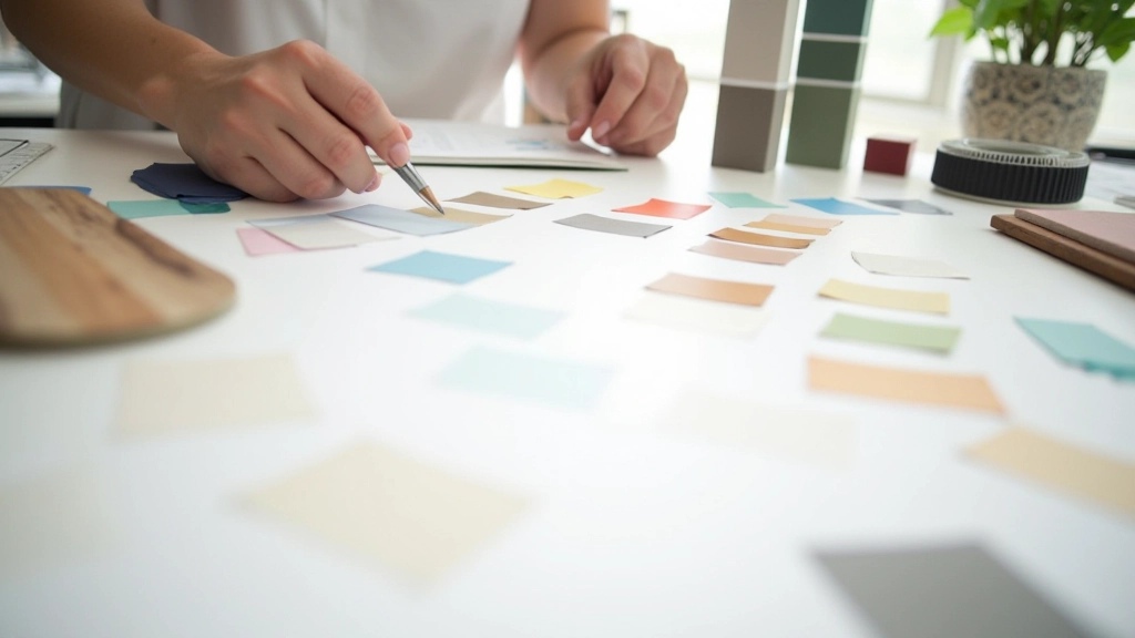
Here’s what doesn’t work: picking colors in isolation. You’ll see a paint chip you love, but when you get it home, it clashes with your flooring or makes your existing furniture look wrong. Always bring color samples home. Test them on your walls at different times of day. See them next to your actual materials — your floor, your furniture, your existing tiles.
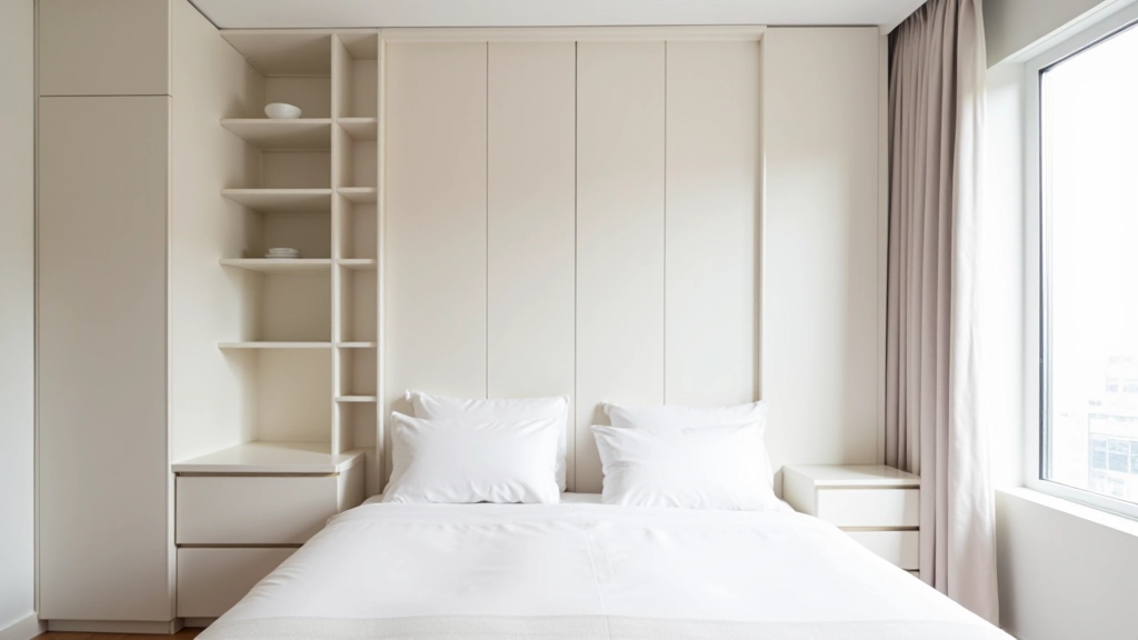
Soft grey walls with warm beige furniture and wooden accents. Works in any light. Feels calming and spacious.
Pale blue-grey with deep navy or teal accents. The cool tones feel sophisticated. Accents add personality without overwhelm.
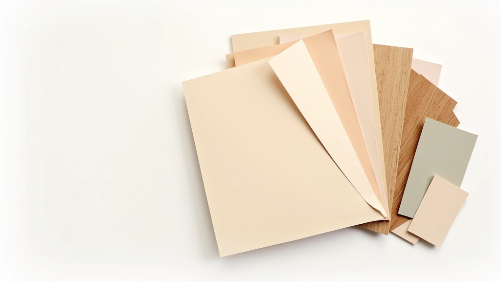
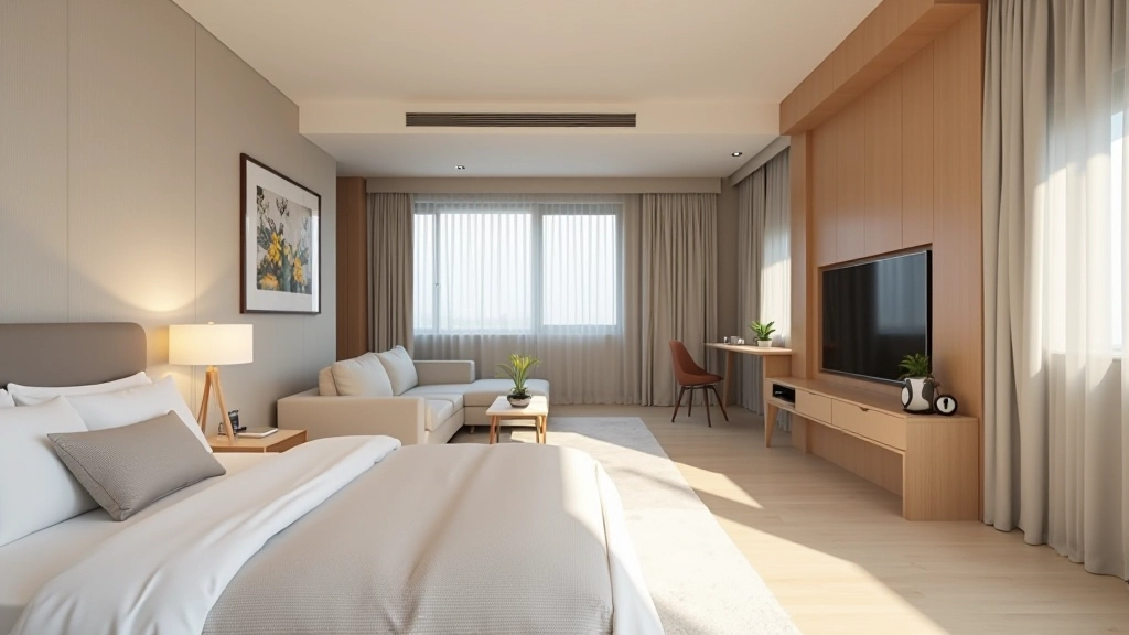
Warm greige (grey-beige) with natural wood and terracotta. Feels grounded and connected to nature. Popular in Hong Kong apartments.
Different shades of one color family. Brings interest through textures — matte, glossy, woven, smooth surfaces.
Materials do two jobs: they look a certain way AND they need to survive your actual life. In Hong Kong apartments where humidity is high and space is tight, material choices are practical decisions, not just aesthetic ones.
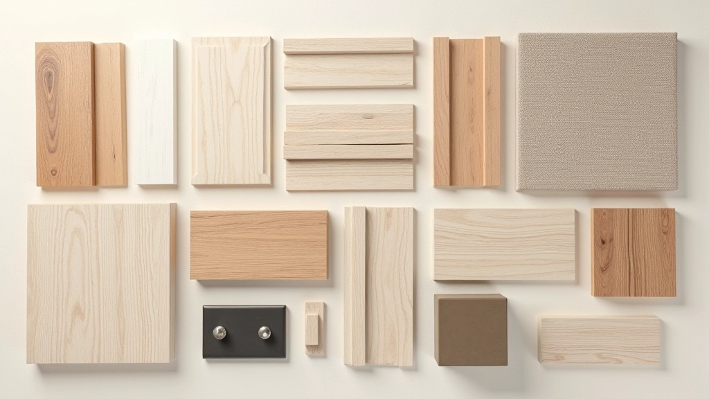
For flooring, you’re probably looking at either wood-look tiles (durable, easy to clean, humidity-resistant) or actual hardwood (warmer feeling but needs more care). Wood-look tiles have gotten really good. They feel authentic and don’t show dirt the way light wood does. If you go with real wood, choose engineered wood over solid — it handles humidity better.
For wall finishes, matte paint feels more sophisticated than glossy, but it shows marks and dust more easily. In a kitchen or bathroom, you might want a satin finish instead — it cleans easily but still looks refined. Consider your lifestyle. Do you have kids? Pets? Then durability beats aesthetic every time.
Fabric choices matter too. Linen looks beautiful but stains easily. Synthetic blends (linen-poly mixes) hold up better in humid climates. For upholstery in Hong Kong apartments, you want breathable materials that won’t trap moisture. Dense fabrics that resist fading are worth the extra cost.

This is non-negotiable. Don’t paint an entire room based on a paint chip. Don’t buy fabric without seeing it in your space. Colors shift depending on surrounding materials, lighting, and even the time of day. A color that looks perfect in the shop looks completely different in your apartment.
Get large paint samples — not tiny chips. Paint an A3-sized area on your wall. Live with it for 2-3 days. See it in morning light, afternoon light, and evening with artificial lighting. You’ll catch problems early. Maybe that color makes the room feel smaller than you want. Maybe it clashes with your existing flooring.
For materials, request samples. Bring home fabric swatches. See how tiles look next to your actual wall color. Some design shops will lend you sample boards for a few days. Take advantage of that. It saves you from expensive mistakes. A 5000 HKD paint job that’s the wrong color is a much bigger problem than a 200 HKD sample purchase.
“The biggest mistake people make is choosing colors without considering their light. They fall in love with a color and then wonder why it looks wrong at home. Light changes everything. Understand your space first, then pick colors that work with what you’ve got.”
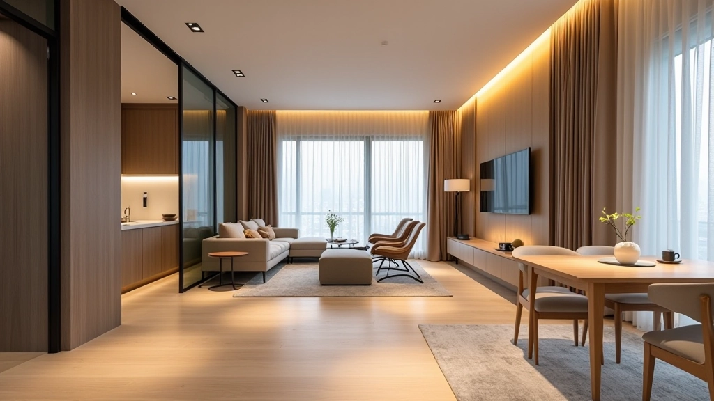
In a small Hong Kong apartment, everything flows together. You can see from the entrance through the living area into the bedroom. This means your color palette needs to feel intentional across all spaces, even if rooms aren’t connected.
Pick a main color story that runs through your whole apartment. Maybe it’s a neutral palette of greys, taupes, and whites. Maybe it’s warm earth tones. Whatever you choose, stick with it. That doesn’t mean every room is the same color. A bedroom might be slightly warmer or cooler than the living area. But the bones of the palette stay consistent.
Flooring is especially important for continuity. If you’re using tiles in the kitchen and wood-look tiles in the living area, make sure they’re from the same color family. The transition won’t feel jarring. If you’re using natural wood throughout, stick with one tone — either warm or cool, not a mix.
Accent colors (that 10% we talked about) can vary by room. Your living room might have navy blue accents while your bedroom has sage green. But your base colors — walls, flooring, main furniture — should feel like they belong together.
Color and material selection isn’t complicated once you understand the process. You’re not making art — you’re making decisions based on light, function, and how spaces actually feel when you’re living in them.
Start with light. Understand what you’ve got and what it does throughout the day. Build a color story that makes sense across your whole space. Choose materials that look good AND work for your lifestyle. Test everything before you commit. Keep continuity so your apartment feels intentional instead of random.
The spaces that feel most successful aren’t necessarily the most expensive or the trendiest. They’re the ones where someone took time to understand the fundamentals — light, color, materials, and how they work together. You can do this. Take your time. Make informed decisions. You’ll end up with a space you actually love living in.

This article provides educational information about color and material selection principles for residential interior design. The guidance presented reflects general design practices and principles. Every apartment is unique — lighting conditions, existing materials, budget constraints, and personal preferences vary significantly. Before making major design decisions, especially those involving significant financial investment, we recommend consulting with a qualified interior designer who can assess your specific space and circumstances. The author and Spatial Design Academy are not liable for design choices made based on this article. Always test colors and materials in your actual space before committing to large purchases or renovations.